Wednesday 14 May 2014

a final composition

After feeling completely comfortable with the design of the main aspects of my environment (the landscape, the Bonobo camp & the building peaks) I wanted to take create a final painting.


I didn't rely heavily on photo references this time around although I have come to terms with the legitimacy of the method, the reason I didn't use it too much this time is that I felt that I could just paint the camp easier without looking for the best reference, I did however use a photograph as a foundation for the environment, although it was fairly heavily modified to create the tone and composition that I wanted.

Sample

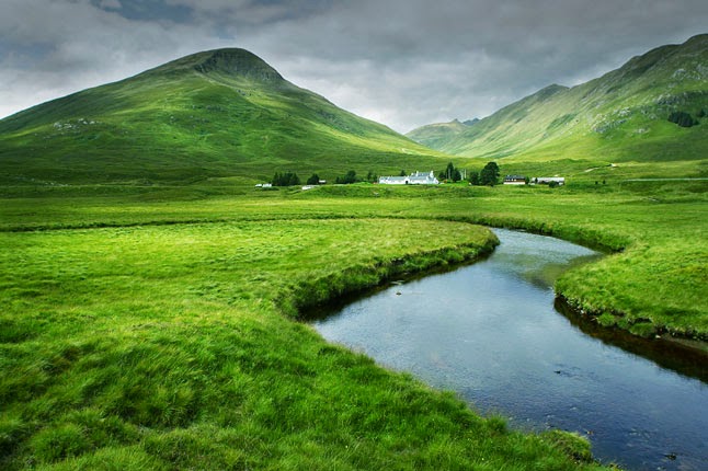
I created a sketch before starting this painting or even finding the above photo so I already had an idea of the composition I was going for so I had to change a number of things: first and most noticeably I change the resolution significantly and my painting is more 'widescreen' as I wanted to capture a certain sense of a 'landscape' that I achieved in my first photo bash and had since neglected. I also ended up changing the path of the river, in the photo graph it bends to the left in the middle of the image which I felt restricted the sense of scale and also harmed the composition with the camp (being my focus) on the right. So I added in the river to run into the mountains and lead the the composition more naturally like that where it would curve around the mountains leading the eyes back to the camp. 

I used another tower building way in the foreground in order to add a sense of scale and also add context to the painting as previously everything was small and in the distance. The Bonobo perched on his doorway adds a reference for scale for the similarly perched bonobo on the doorway of the distant tower which I felt would otherwise be unidentifiable. I also used this to add further to the composition and lead attention back to the main camp and add further sense of scale and vastness to the landscape.

sketch

Despite being a culmination of my previous design work this painting still serves a purpose as concept art, I introduced an idea of smaller pyramidic buildings surrounding the main tower, as I felt that the tower alone wouldn't be a convincing camp. For the first time really I placed the bonobos in the environment. I also toyed around with that old idea of the white scrawling graffiti that I added earlier as a 'decoration' on the buildings with the same purpose of warning and defining territory. Then I added white paint around the doors too to fit aesthetically with that and since they looked like boring 'slits' before which is essentially what I wanted them to be but it lacked character.

Thursday 1 May 2014

revisit an old drawing

After feeling a bit more confident in my tonal drawing now I decided to revisit one of the older drawings this time using pencil for the initial drawing and the lines. There isn't a whole lot to say as it's just a revisitation of a drawing I've already explained, but I think I have improved the composition. 


I've also gotten more confident through the course of this project in 'placing' the main object in my environment. I used to be overwhelmed by the potential of the environment in which I place the main object but I've gotten more comfortable with keeping it simple and in this case it is a building peak on the edge of a cliff so I have been able to really just keep it simple.

Previous version for reference


Tuesday 29 April 2014

A complete illustration

After my preview drawing and having established the design of the bonobo settlements I felt confident in creating a composition that included everything so far, the settlement and the human ruins. I decided against my previous decision to have the human ruins in a state of having been almost entirely decayed. I wanted some of the old details visible as I felt that it would be aesthetically more pleasing and I had in mind an idea that the passing of humans and their legacy (the robots) would almost be religious, in a way humans were a god that created life and transcended leaving only behind the monoliths of their past civilisations, so in that way the details of the cathedrals would be important.


Again I edited the image in photoshop as I didn't want to just leave it as a black and white line drawing, this time I actually move an object (the building on the left) as I felt it was too far out of the image and ruining the composition, it flows better now closer in. I went with a similar colour as the other image for consistency, even though I did experiment with another bluer colour, but it looked like an alien planet o something so I used the older version.


Sketching in Chapelfield Gardens

Today as part of life drawing I went to chapelfield to create some pencil sketch studies of the natural things in the park such as trees and plants.

First I did some quick studies of the trees around the park.


After finishing the studies I created an original composition based on something in the park, I chose a building in the center of the park that I immediately felt could be adapted to my concept.


I increased the scale in the style of the towers in my game so far and changed the aesthetic to fit.


I added tiers of living space in the style of the previous drawings, with small harder to access rooms at the 'roof' and a more luxury sheltered group of buildings underneath, the idea was that it would have been build onto an old human building but that was kind of lost, the platform is kind of just generic now.


I added some tone in photoshop but didn't shade at all this time around, I made a conscious effort to add realistic shading in the pencil sketch so I decided to let that speak for itself and simply add tone to separate the foreground and the background. I also added some very small modifications such as the support ropes* which I made more obvious and changed the positions to make them more even and aid in the composition. I also added a sepia tone using the 'colour balance' menu red gradient just for style, then added red to the banners to accentuate them (although I haven't gone over the top I felt that decoration would be important in the design of the tower..

*support ropes are there mostly for aesthetic purposes and for balance, but could be used by the bonobos as access.

I'm very happy with the development of this sketch, I felt like the overall shapes of the towers so far have been very blocky rectangular and uninspired, it actually looks interesting and unique now.

Monday 28 April 2014

painting on the initial sketch


I felt confident that I had a slightly better idea of the general value placement from the last photo sampled painting that I did so I wanted to have another go at painting one of my sketches to test it and also develop the idea.


The first thing I did was just to block in the very general mid tones with the intention of adding shadows, and small amounts of extreme lights and darks (high lights and the darkest shadows used sparingly so as not to create a muddy or flat painting)


I started to add shadows by actually taking into account cast shadows and the direction of the lighting and I think this is an improvement from my last attempt already, it already looks more real. I also used to ignore what was happening outside of the composition, it occurred to me that there would be trees or something behind the camera and the shadows they cast would actually be visible, those shadows also serve to balance the composition.


After finishing the shading and adding highlights I was happy enough to actually try adding some colour to the drawing, I have still left the lineart for now becusae I never intended for this to be a complete painting but I may actually go ahead and blow this up to a larger canvas and polish this as a part of my finished work, I'm pretty pleased and I think I have enough of a foundation to start working on a finished painting, and it would be nice to have an actual painting to show as a culmination of all of this work, I'd like to add a bit more colour though as it's just monotone now.

developing the Bonobo settlements

Using the reference I posted previously I created a rough sketch


I wanted it to look primitive but not tribal, as I felt that it would be generic and I wanted give a sense that this world is developing, not some perpetual state of primitive tribal culture. I really liked the image with all of the different shaped and size buildings in this tower:


It has sort of the look of a ramshackle tower where many people could live, I am sort of sticking to the idea that the bonobos have this sex culture so they would all be very close and having them all live in a tower with close open rooms would enforce that, and I also wanted to preserve some of the 'monkey' qualities of the apes and so an open access tower where the bonobos would climb around outside to the desired rooms would work with that, there are bars below each door for climbing access.

So I used this tower as a the main reference for the architecture and then added an aesthetic more similar to that of the Monster Hunter games that I wanted to use for inspiration, it's that kind of lively and colourful aesthetic.

Based on this drawing I tried to make a painting:


I'm not happy with it at all, I think I lost the aesthetic completely and in the way I painted it I lost a lot of the details and architecture that I liked. 

I returned to the photo sampling method that I had been successful with in the past, and I took the tower image above and another that I thought would ground it into the environment and worked from there.


This is just an early stage where I placed the two objects on the canvas and began to integrate them and add lighting. At this point the lighting was arbitrary and inconsistent. that was a problem I was having and was probably holding me back in my value studies before; I wasn't putting enough emphasis on shading and lighting.


I saved some progress shots but this time around I will just skip right to the end, I think I fixed the lighting and the image is better for it, I also had a much easier time painting using the lighting as a guide, there are a few things I am unhappy with actually such as the lightly coloured roofs which look unfinished that I will probably work into later.

One of the things I was pleased about was how I managed to use photo samples in this image but not leave too much evidence of them in the end, the shapes are sill entirely there but I did modify them and I sampled colours in such a way that things are actually coloured a lot more differently and vibrantly than they looked when the photos were positioned initially. I used a separate image of clouds but I had to actually cut that up and distort it in order to work with the perspective, I also added some atmospheric perspective toward the top of the tower to give a sense of scale. 

One of the other things I found was that the composition wasn't great from just placing the objects so I had to actually make an active effort to creating a pleasing and functional composition while painting, such as the clouds, the positioning of the buildings and the 'pathway' at the bottom of the images which balances the composition.

Wednesday 16 April 2014

Taking a turn to make the game more colourful

I started out with the intention to make the game look colourful and fresh and I kind of lost that with my inspiration of Dark Souls, while I do still want Dark Souls in influence the tone of the game I want some more lively and colourful designs.

Another game that is like Dark Souls in Monster Hunter, just by chance I recently bought an art book 'Monster Hunter Illustrations, and in a time of severe art block and lack of inspiration it sparked something.


Monster Hunter has this really great design where the villages are very colourful and lively while the wilderness areas where you fight monsters are more natural and desolate, which is an atmosphere that I would quite like to emulate, I have already established that desolate and natural wilderness with the remains of human architecture littered around the environment.

Since starting to focus in on the Bonobo camps I started to really lose inspiration and I was drawing blanks most of the time, I didn't really have any main influence but now I think I have somethign to start from. 

I was always sure that the bonobo tribes would be very colourful and flaunty; it's something I didn't intend to touch on until I start character designs later but the Bonobo (of today) have highly sexualised communities, they are very liberal with sex and use it almost as currency and conflict resolution, I intend to have this play a significant role in their evolution as they develop increasingly intricate cultures based on this economy of sex. 

I collected some reference first of some screenshots and concept art of villages in Monster Hunter to use as inspiration.


From looking at these images I feel like I have a better idea of what kind of aesthetic to shoot for now, but so that I'm not just copying the monster hunter style villages, I wanted to rather use that as a foundation to find my own references to use, for now I just had a look in my existing reference folder which is just a folder where I put images I saved for potential future reference and it comes in handy for times like this where I just need quick inspiration.


This colourful and exuberant village design also helps distance the aesthetic from the generic brown and grey post apocalypse, and enforce the idea of a new world and a fresh start.