Wednesday 8 May 2013

Metal Gear Solid 3 storytelling research

Films that inspired Hideo Kojima (MGS3's creator) and how they likely affected Metal Gear Solid 3


Notable examples

The Deer Hunter

Full Metal Jacket
Predator 
Die Hard
Escape From New York

Kojima was clearly influenced by the jungle warfare of Full Metal Jacket and The Deer Hunter, both set in the Vietnam war, and Predator in which Arnold Schwarzenegger fights an alien predator in the jungle using camouflage and military techniques to aid him. 

Full Metal Jacket and The Deer Hunter most likely inspired mostly the setting and tone f the game where-as predator would influence game-play mechanics like camouflage and using face paints to avoid being seen by the enemy.

Die Hard could have influenced the stealth aspects of MGS3's game-play, in the film John McClain must navigate through a building riddles with armed guards in order to stop an evil boss-guy, similar to the game-play in Metal Gear Solid 3 which is set in a secret military base camp in the middle of the jungle. 

The actual character of and Naked Snake (and Solid Snake respectively)  is also clearly based on the macho american action hero, they are even named and modelled after the main character Snake in the 'Escape From' series of films (Escape from NY and Escape from LA).

He even later acquires an eye-patch

'(codenamed Snake Solid in reference to Kurt Russell's Snake Plissken character in the movie Escape From New York)'


Dead Space: USG Ishumura research

The Planet Cracker


http://www.creativeuncut.com/gallery-23/art/ds-usg-ishimura-planet-cracking.jpg

'The USG ishumura is a planet cracker, a hulking industrial ship that is designed for one purpose; to mine entire planets in a bid to save a dying earth' 

'"the Ishumura came about because we really wanted to do some big sci-fi ideas in the story"  says Ben Wanat "We wanted it to be grounded , but we also wanted to throw in some elements that border on the fantastical [...] you've got a large industrial ship that goes out and destroys an entire planet to get the resources from it"

'It is that spectacular function that initially dictated the Ishimura's design [...] "in the initial designs, it was these glistening towers and this almost beautiful setting. But we thought that wasn't going to work for horror- so we took this notion of an oilrig out at sea and built that into this planet cracker idea'

'The grounded industrial roots of the USG Ishimura can be seen in the exposed ironwork and creaking steel that keeps it together. It is a structure that is unequivocal in it's own construction - an explicitness that is an essential part of the design.'

'although a fantastical ship built some four hundred years in the future, it's a living, breathing space with weight and beleivability'

- Mark Robinson (2013). The Art of Dead Space. London: Titan Books. p28.

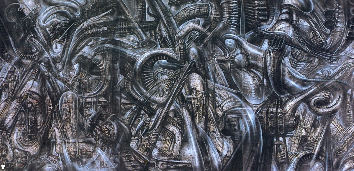
Looking into the way in which the USG  Ishimura (the planet cracking ship in which Dead Space is set) uses the human body and particularly ribcage shapes to create a feeling of horror.

http://www.everythingscary.com/photos/albums/userpics/concept_ishimura_from_below_download_021208.jpg

'From the outside, the USG Ishimura looks like the upturned corpse of a dead animal, it's bones exposed to the elements'. It is an intentional reference and one that seeps through much of the Dead Space universe'

'"We started this creating this motif in the fiction that everything would have  these ribs repeated everywhere" Syas Mark Wayat "I think that, more than anything, is one of the marks of Dead Space, where you see these horizontal slats everywhere, even on Isaac's face. That all came from the Ishumur's design."'

- Mark Robinson (2013). The Art of Dead Space. London: Titan Books. p29.


http://s4f808227c3a27.img.gostorego.com/802754/cdn/media/s4/f8/08/22/7c/3a/27/catalog/product/cache/1/image/9df78eab33525d08d6e5fb8d27136e95/s/p/spine_with_rib_cage.jpg

http://image.shutterstock.com/display_pic_with_logo/427288/427288,1276516279,1/stock-photo-bare-bone-remains-of-a-dead-animal-55159366.jpg

How the decision to use human body anatomy in the design of the ship could have been inspired by H.R Gigers designs for the film Alien 

http://25.media.tumblr.com/tumblr_m5i09ght0n1qejbtco1_1280.jpg

http://bloody-disgusting.com/photosizer/upload/hr-giger-necronom-iv121310.jpg

http://img.bhs4.com/3c/1/3c17f64e9e5a18d57b002345aa153bb7a0370e1d_large.jpg

Fleshy walls with body parts make the ship feel almost like it is alive.

http://images2.wikia.nocookie.net/__cb20100827234733/deadspace/images/6/61/Dead-Space-2008-10-25-18-30-55-51.png


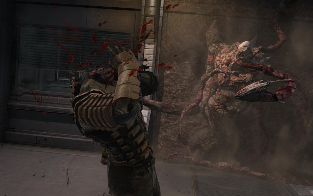
Potential influence: the Infector enemy from dead space (left) i aesthetically and functionally very similar to the Facehugger in Alien (right)

Making the world feel real


''"we really needed to make the ship feel like something they completely believe in, and that is really key to the horror experience." Logos and iconography hinting at a world beyond the ship's hull helps ground the Ishimura in a sense of reality'


Tuesday 7 May 2013

Trying to figure out how to get the plants working for UDK

I had originally designed the plants to work with a transparent PNG file, and it looked great I think, just how I was expecting it. But when it came to exporting the objects to UDK I found that using PNGs doesn't work as the transparent background shows up as white.

As a fix I decided to try the alpha channel TGA method, I figured it out. The first problem I had was acheiving the varying opacity within the plant texture but I overcame that quite easily by just copying the plant  layer and painting over it in white using 'lock transparent pixels' on photoshop. 


But even after that the texture wasn't looking quite right when I applied it in maya, the transparency wasn't perfect so I was getting almost translucent white where I should be getting a translucent green.


Unfortunately, as the plants haven't turned up to satisfaction in the end, I might just leave them out entirely, I really liked how they looked as PNGs so it will be hard to have to not include them at all but I feel like they will bring down the overall quality I have achieved rather than compliment the environment as they were supposed to. If I can't find some way of fixing them I will get rid of them entirely.


Monday 6 May 2013

Finished texturing


I have finished the initial stages of texturing my environment, all of the objects are painted but still flat.

I had a look at using some bump maps on some of my objects but I was unhappy with how it looked, I don't have any images to show my experimentation because it was short-lived, but I decided that given the minimalistic nature of my model so far that the bump maps were just jarring to the overall composition.

I decided instead to imply texture by conservatively using specular maps on their own instead.


The most important specular map was for the windows because they needed to be a lot more reflective than anything else in the environment as everything else was mostly dull and matte.


I used a specular map also to show the worn paint on the casket shop, the areas where the paint is left-over is shiny compared the areas of wood that are totally dull.


It was similar with the coffins, the coffins are supposed to look freshly made and varnished, originally rather than a specular map I just changed the specular colour to make it shiny, but I thought that it looks boring and flat so I used a specular map to include the pattern from the wood grain, I used the wood grain pattern with a darker colour so that it would contrast with the body of the coffin and add further detail. 


Thursday 2 May 2013

Update

Just an update since I've done a lot of work and haven't really written anything, mostly because I have just been painting my textures and trying to get them to look right and for the colours of each asset to work together.


Nothing much as changed since last time, I've decided to go less for the outline approach to the textures and paint them a bit more without having to rely on line drawing, I think it looks nicer, the line drawing textures didn't look as good as I would have liked, I have still used line drawings but more conservatively and only where I think it would really benefit  for example I did a line-art for the wood grain in the coffins and the cracks on the skull, I think that used minimally like that it really works and looks nice, without it being a crutch (before I was using outlined for a lack of confidence in painting my textures so I was kind of relying on it where-as now I'm using it when I think it will actually compliment the texture).

I got rid of the horse because after fully texturing it, it just didn't really blend in the the ground well enough, and the only reason I was going to use it was because I thought it would look cool with the outline drawing style I was using before but scrapping that gave me more reason to get rid of the horse. I think that having gotten rid of the horse the environment actually works better compositionally now, it flows really nicely I think, there is a nice curve around the track, the dust path and the buildings' alignment.

Comparison of the old line drawing texturing (left) to the new painted textures (right)


Dead Horse asset before being removed